Project Brief
Overview:
UI Refresh with UX Overhaul
Youtech maintains its current asset inventory in Google Sheets. I was tasked with taking their new client portal platform that was a mirror image of Google Sheets and update it to create an easier User Experience for both the internal team and client facing side.
Goal:
Streamline the Asset Inventory to be clear, concise and easy to use
Upon completing a thorough assessment and audit of the current Client Portal platform, I was able to identify the problems of the current site and present solutions that would allow our clients to understand and navigate the platform, as well as making it easier to use for our internal team to enter and import data.
Design Process
The Process:
Discovery, design sprints, project flow and collaboration
As the lead on this project, my duty was to speak with our internal team on how the process works, discover and highlight what elements are most important to the client and internal team, and take all that to create the design sprint. We broke down the design into three phases. Phase one: finding bugs in the current system and fixing the problem to allow for an initial launch that our clients can use. Phase two: Updating the current UI with a slight refresh, while implementing new UX elements to create a better asset management process. Phase three: Prototype the designs and collaborate with development to make sure all actions are clear and feasible.
UX Research
Team Discussion
Without the ability to test the software amongst a pool of users, I needed to adjust the UX process slightly to gather as much information as possible from our internal team. I spoke with Directors, Project Managers and our members from SEO to understand how each team utilizes the portal. I needed to understand how and why things were being done, while filtering out specific wants and needs from individuals to create a system that best works for everyone. In my findings, I was able to pinpoint common issues and was able to create a system that will satisfy all users, and still allow for the client facing side to understand the portal as well.
Key Takeaways
- Inputing data needed to be streamlined to allow for faster entries
- There seems to be a lot of clicks in order to enter simple data fields
- Entering data was not as clear going from Google Sheets to the new Client Portal
- Highlight the most important information first upon landing
- Implement new features that make communication and tracking clearer
- There seems to be a lot of clicks in order to enter simple data fields
- Entering data was not as clear going from Google Sheets to the new Client Portal
- Highlight the most important information first upon landing
- Implement new features that make communication and tracking clearer
Initial Notes
Research Conclusion & Outline
After discussing with many team members, consulting with directors and planning with our developers, I broke down what needed to be completed and implemented for each stage of the design sprint.
Phase 1 - Bug Fixes
The original Asset Inventory was the first thing to address. We decided to fix all the issues with the current iteration of the Client Portal. I created a Google Sheet to document all bugs and errors to be logged and fixed by our development team. Once we cleaned up the bugs, we pushed it to the clients, and started transferring over our logs into the system to be used going forward.
Phase 2 - UI Touch Up, UX Upgrade
Due to a short time-line for pushing out the next phase of the plan, we worked through a slight refresh of the current UI, focusing our efforts more on the UX and user journey to streamline the data entry process. Below are the new features I outlined that our team confirmed to implement.
+ Notification System: notify clients and internal team when actions are done in the portal
+ Assigned Specialist: each client would have an assigned Specialist
+ Version History: anytime an entry is made, you can see the version history for better tracking
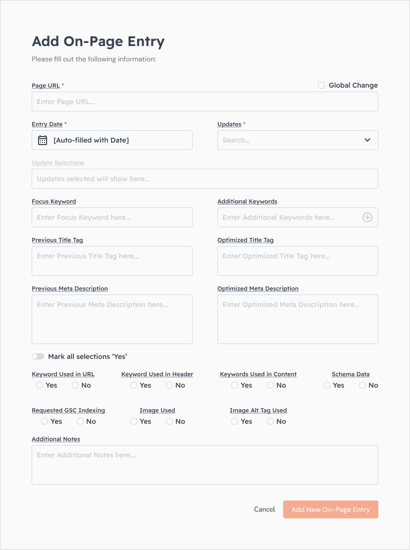
+ Step-by-step Entry Form: for better clarity and ease of use
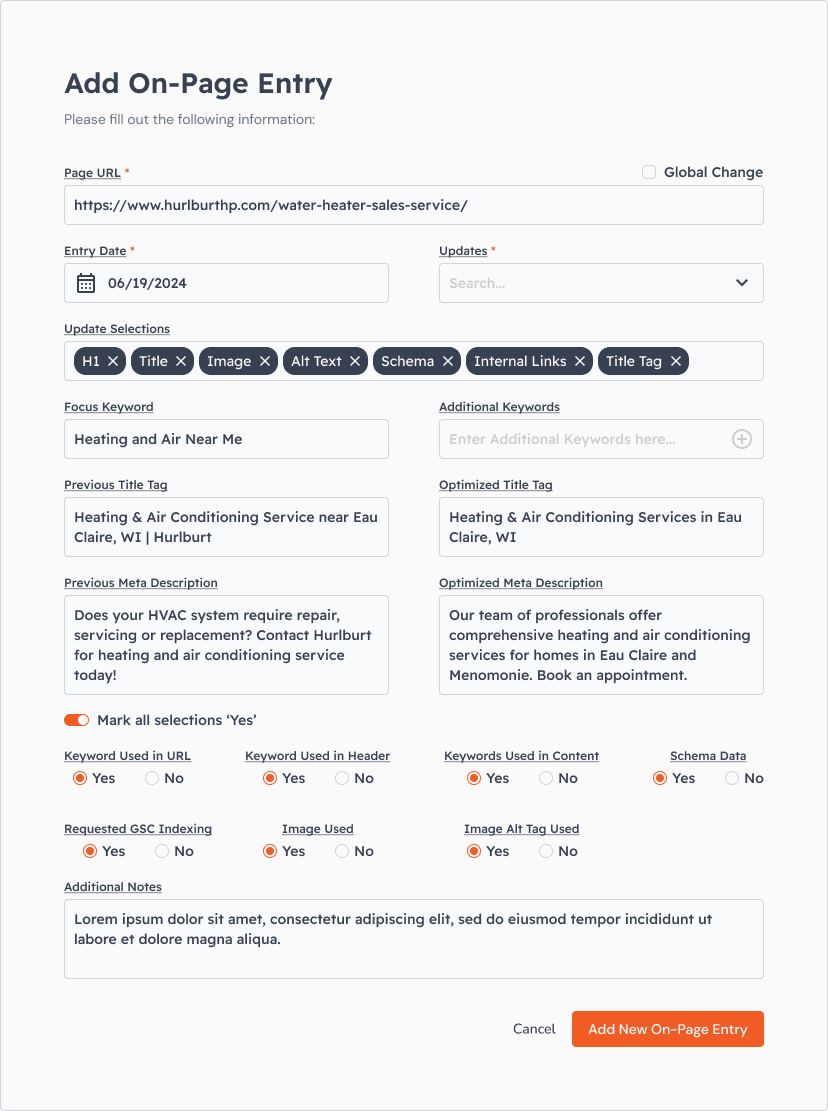
+ Quick Actions: adding in a function like 'Mark All Yes' that helps speeds up the data entry process
+ Ahrefs API Integration: live data feed for up to date SEO information
+ User Dashboard: homepage that houses all relevant information for both client and internal users
Phase 3 - Prototype & Collaboration
Once we nailed down the design direction of the second phase of the rollout, I created prototypes to show development the step by step process of user actions. We focused on major functions like adding a data row, editing and deleting a row to start, as this function would be used throughout the portal. Then we focused on the minor interactions like entering data into the form so they could understand the step-by-step breakdown. After we completed the bulk of the prototypes, we talked through to make sure we all understood the function and identified any possible issues. From there, we went into the next phase of development.
Phase One Designs
Login
Profile
Backlinks
Misc. Tasks
Data Entry Overlays
Phase Two Designs
Login
Profile
On-page
On-page / Expanded Row
On-page / Data Entry Overlay / Empty & Filled
Phase Three Designs
On-page / Prototype
Client Modification / Prototype
