Project Brief
Overview:
Personalization, intuitive Design and scalability
Wescom Credit Union, headquartered in Southern California, provides comprehensive financial services to over 200,000 client members, and that customer base, as well as demographic range, is growing. Wescom strives to provide excellent customer service to their members, placing a high value on personalization, and in building and retaining long-term relationships. Having recently redesigned the Wescom online banking website, the Wescom team was ready to take the next critical step in redesigning their integrated mobile banking app.
Goal:
Design a streamlined and modern mobile banking experience
Upon completing a thorough assessment and audit of the current Wescom Mobile Banking App, our design team engaged in a collaborative project-long series of design sprints with the Wescom director and stakeholder teams, including IT, development, marketing, financial services and digital development.
After gathering the Wescom team’s wish list items, internal company user data and feedback, combined with extensive competitive analysis and research, our approach to designing a streamlined, modern, mobile banking experience - took shape.
Problem
The Challenge:
Optimizing the user journey
Redesign, develop and optimize Wescom’s mobile banking app, integrating with the online banking
ecosystem, delivering frictionless functionality and access to services in a connected user flow,
scalable to the next planned Phase 2, products and services.
ecosystem, delivering frictionless functionality and access to services in a connected user flow,
scalable to the next planned Phase 2, products and services.
Design Process
The Process:
Discovery, design sprints, project flow and collaboration
I was the lead on this project. From Initial Discovery to the Asset Handoff, I was part of each stage
of the process. I primarily focused on the Wireframe to Visual Design & Prototyping. For our weekly
collaboration meetings with the Wescom team, I was designated as the discussion lead for our team. This included answering client questions and explaining the design reasoning behind our project updates.
UX Research
Initial Discovery
In the initial phase of our discovery, we sat down with the Wescom team to discuss the project scope and their objectives for the app. They started with an internal company survey to identify dislikes within the current UI to initially gain the perspective of the Wescom employees. Their responses were influenced by personal user experience, as well as outside comments and feedback provided by Wescom Credit Union members during interactions.
Mobile App Dislikes (Based on Wescom Internal Team Responses)
- Members can’t get to their balances right away
- When phone’s font is enlarged, the menu turns into multiple pages without a queue of the paging
- Navigation screen is no longer efficient to go back and forth between balances and transactions
- Dark Mode lack of complete implementation
- Can’t see pending items link from balances
- Not having a promotional banner on the balances
- Not having interstitial pages on the balances
- Not having an open an account on the logon page
- Not having an ‘apply for a loan on the logon page
- Not having help links or contextual help available on all complex screens
- Transfers sub-menus: Same Account, Other Members, Other Institutions
- Having to uninstall and reinstall the app after Apple transfer the app to a new phone
Initial Notes
Wescom Current Application Usage
As part of the initial discovery, the Wescom team presented us with data surrounding current app usage and the functionalities. This data represents what the members use most when engaging the mobile application. The collected information is calculated based on what functionality the user engages with the most. Based on current information, these are the areas Wescom members utilize most within the mobile app:
Competitive Analysis
Our team was able to pull up a 2020 Informa Report by Financial Intelligence that tracked mobile banking servicing metrics. It highlights 11 different mobile banking applications and provides a multitude of statistics to distinguish the services and capabilities each bank offers. This report gave us much insight into the app functionalities and capabilities across the different banks. We were able to use this information to make sure we were implementing the necessary services, while incorporating additional functionalities to close the gap between the actionable items. These were the takeaways:
+ The Citibank app had one of the highest app store ratings, but was on the lower end of services offered. Is this an example of quality > quantity?
+ Are there any features or services that are uncommon amongst competitors that Wescom could benefit from?
+ Apps with the highest ratings had more services in common than those with lower ratings.
+ Are there any features or services that are uncommon amongst competitors that Wescom could benefit from?
+ Apps with the highest ratings had more services in common than those with lower ratings.
Wescom Member Survey
With the help of the Wescom team, we were able to conduct a survey containing a few basic questions to get an understanding on how the current users perceive the current UX/UI. We wanted to understand the likes, dislikes and needs of the current user base to enhance their user experience, while also taking new users into consideration. We asked the app members three questions:
+ What do you like about the Wescom app?
+ What do you dislike about the Wescom app?
+ Are there any features or enhancements to the mobile app that you would like to see?
+ What do you dislike about the Wescom app?
+ Are there any features or enhancements to the mobile app that you would like to see?
Survey Results
After parsing through over 200 responses, the overall consensus of the current app was positive. Members seem to enjoy the app and there wasn't a significant amount of feedback or change requests. They enjoyed the fact that it was easy to use and convenient. The Zelle functionality was the most common feature that was disliked and needed improvement. There was little to no mention about the current app UI design, leading us to believe that users were satisfied in this regard. As a team, we decided to use these design principles as the foundation for the UX/UI of the app.
Simple
Based on research up to this point, the current Wescom user base values the ease of use over most everything else. In the transition to the new redesign, our priority needs to always be simplicity, and it is not necessary to change user patterns.
Familiar
With many members satisfied with the current UI, we felt it was important not to overhaul the entire application for the sake of a redesign UI. We thought it was necessary to redo the UI to make it more modern, but not go overboard with design aesthetics.
Engaging
Although we do not want to overload the app with a lot of new components and design, we still think there are areas that could benefit from improvement. We want to strike the balance of old and new, so that users can find benefits in places they didn't know needed it. We also think that these improvements could allow for higher new user engagement.
User Personas
We created the user personas based on the research we conducted so far, as well as addressing the goals of the Wescom team. Not only did they want to increase the user experience of the current members, they also wanted to attract new members, especially the younger generation. Based on some of the research, we found that credit unions are not a big choice amongst the millennial crowd, and the average age of credit union members is 47. Using our previously conducted research in the website redesign of Wescom prior to this project, as well as current research, we were able to identify two user personas. By creating this personalities, we were able to figure out the wants and needs of both to better guide our approach to design.
Research Conclusion
Upon sorting through all the information, we came to the conclusion on how we will approach the redesign process. With current members having an overall positive opinion of the app and the Wescom team wanting to compete with some of the more well known banks, we had a few questions that needed to be addressed in the upcoming redesign:
+ How do we add value to a user base that thinks they have everything they need?
+ How do you complete a redesign that not only satisfies current members, but intrigues new ones?
+ What kind of changes can be made in order to engage the younger generation?
+ How do you complete a redesign that not only satisfies current members, but intrigues new ones?
+ What kind of changes can be made in order to engage the younger generation?
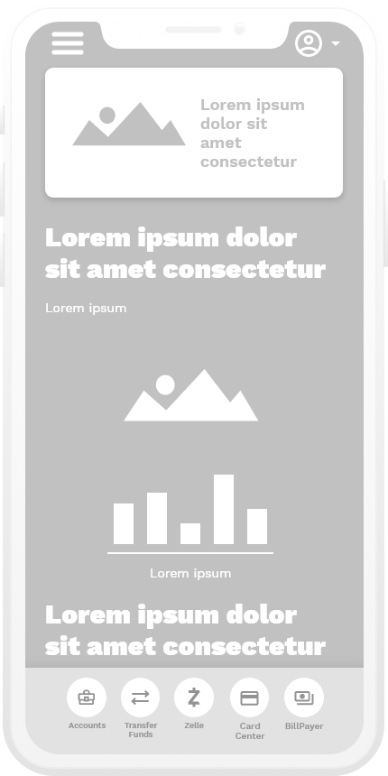
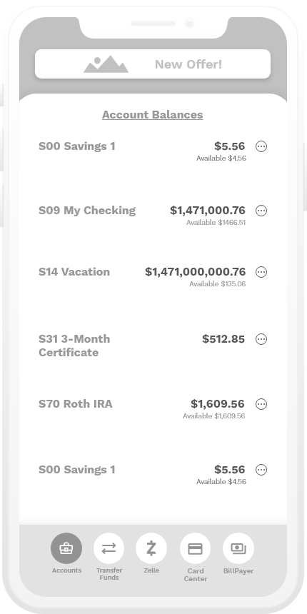
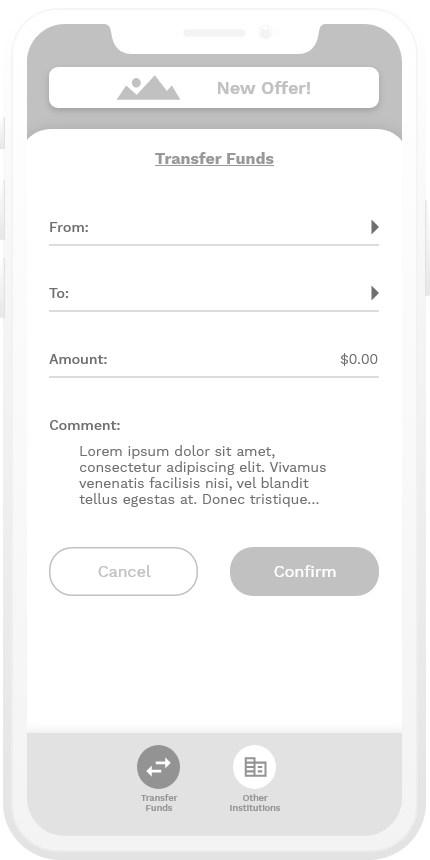
Wireframes
Initial Sketches
Phase 1
Phase 2
Design Critique
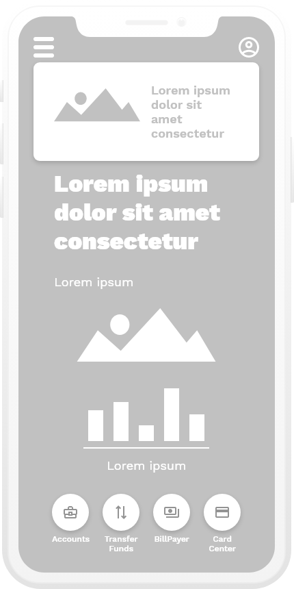
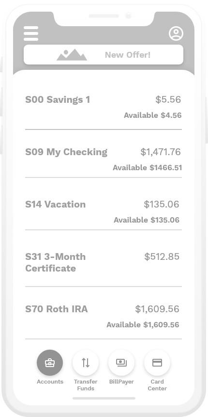
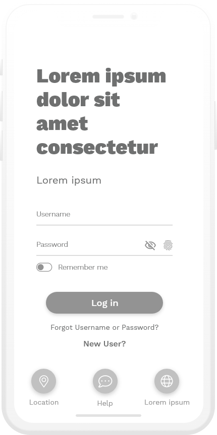
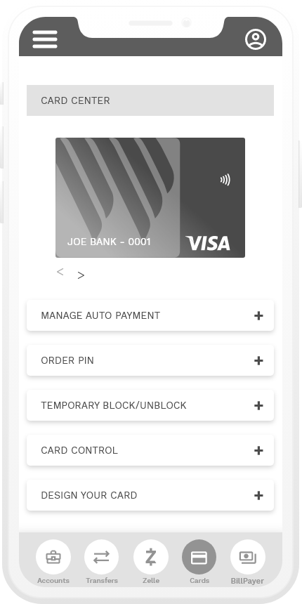
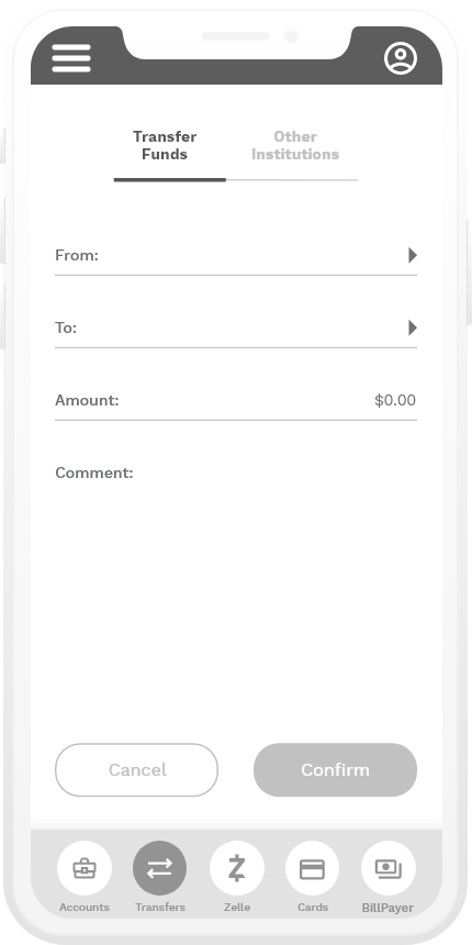
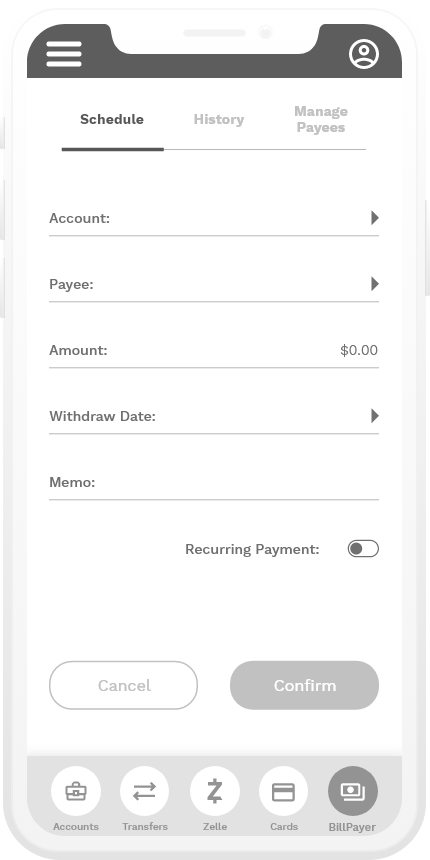
After working through these phases, we spoke with the Wescom team to really narrow down a structure. Although they appreciated our creativity and willingness to implement new ideas, they decided that they wanted to simplify this even more, given their development capabilities and project scope. They wanted to keep it as basic as possible, while still cleaning up the design.
Phase 3
UI Designs
Overview
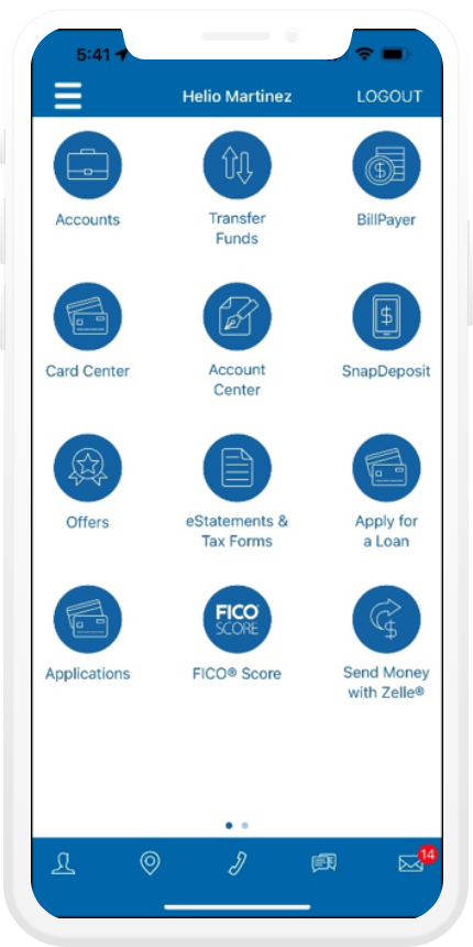
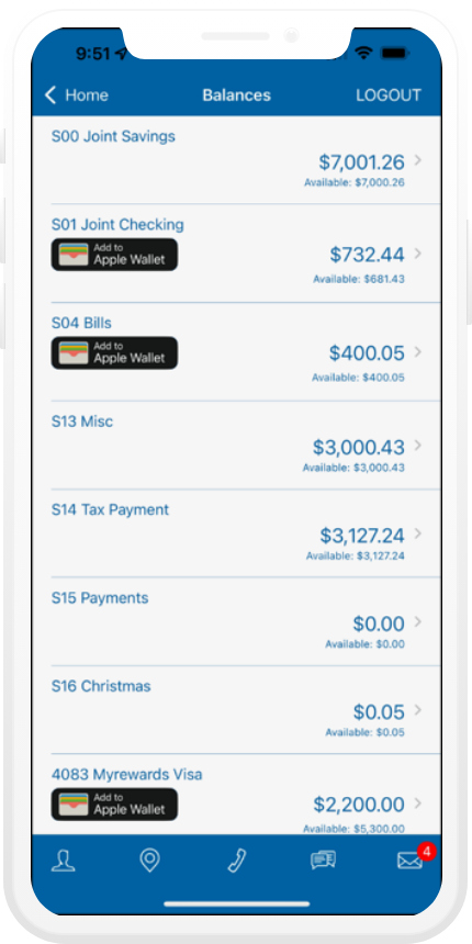
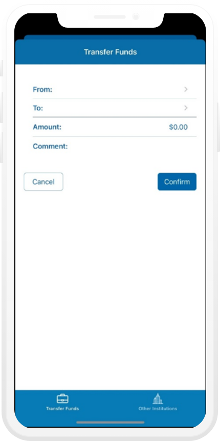
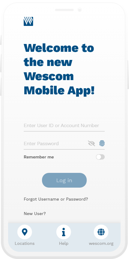
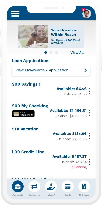
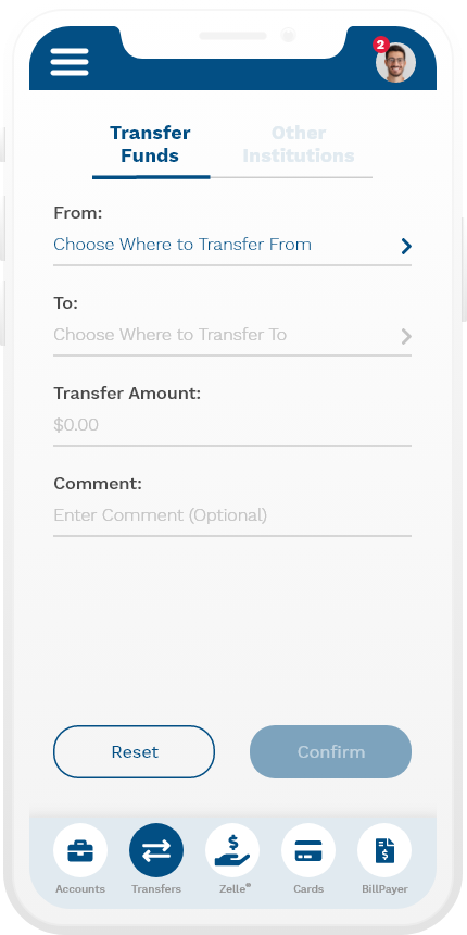
After the confirmation of the wireframes, our team moved into the UI designs. Below is the interface from the current user interface, followed by the redesigned application.
Current Mobile Application Interface
Redesigned User Interface
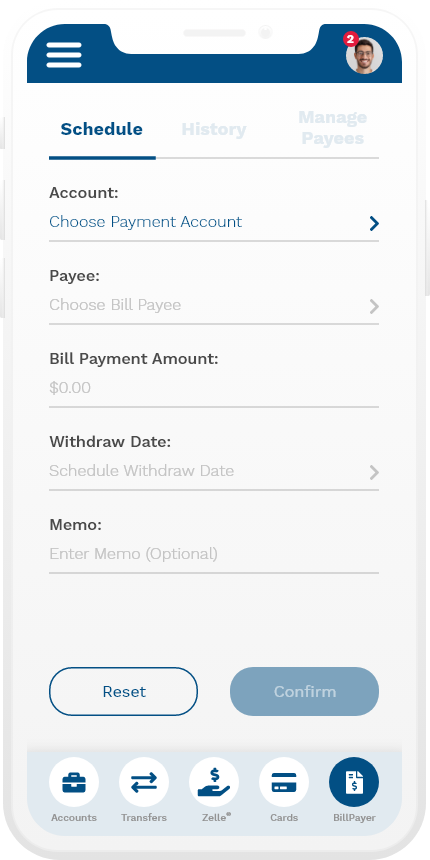
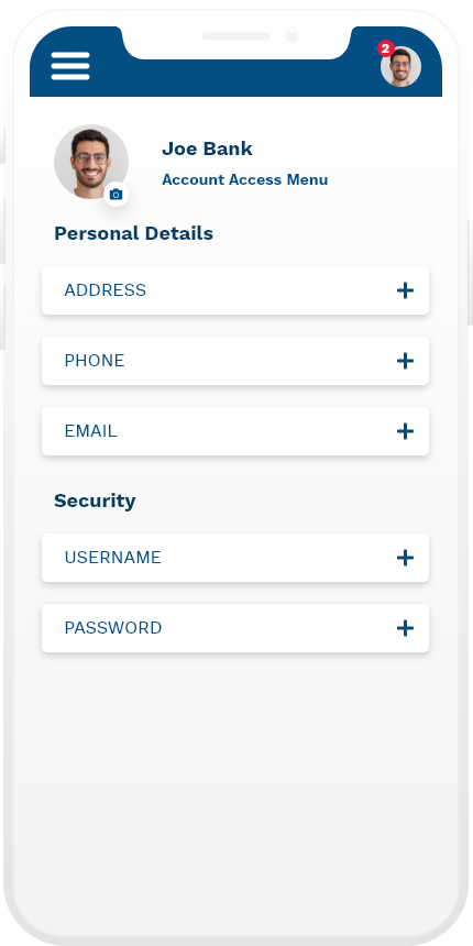
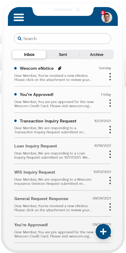
Apple Watch
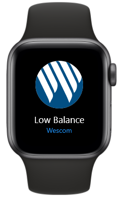
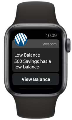
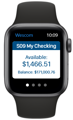
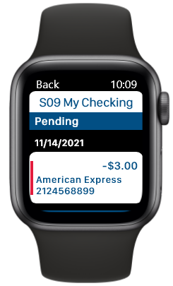
In addition to a redesign of the mobile interface, the Wescom team also tasked us with updating some of the Apple watch screens. We were able to use the existing Apple Watch structure as the foundation, and made a few adjustments to upgrade the UI. Below are some images of user testing for early mockups, followed by final designs.
User Testing
After completion, the Wescom team presented the new designs to stakeholders within the company and provided feedback. The new designs were well received and satisfied the updates they were expecting to see, barring minimal design changes. Here were the takeaways:
+ Clean, distinct design
+ Clear user flows and pathways
+ Positive reception to updated hamburger menu and profile menu
+ Clear user flows and pathways
+ Positive reception to updated hamburger menu and profile menu
Soon after, we finalized the designs and passed it over to the Wescom team to begin development and user testing.
Outcome
Conclusion
Although the Wescom team decided to go a different route, overall, the reception was very positive. Our team was able to capture the overall goal presented by their team: create a mobile application that reflects the modern and clean design of today’s mobile banking apps, while maintaining the overall base structure that is present in the current interface. We felt we were able to satisfy all the needs of the different persona types. We wanted to create an app that allows for familiarity in the user flow, but updated to create a more enjoyable and efficient user experience.
Prototype

