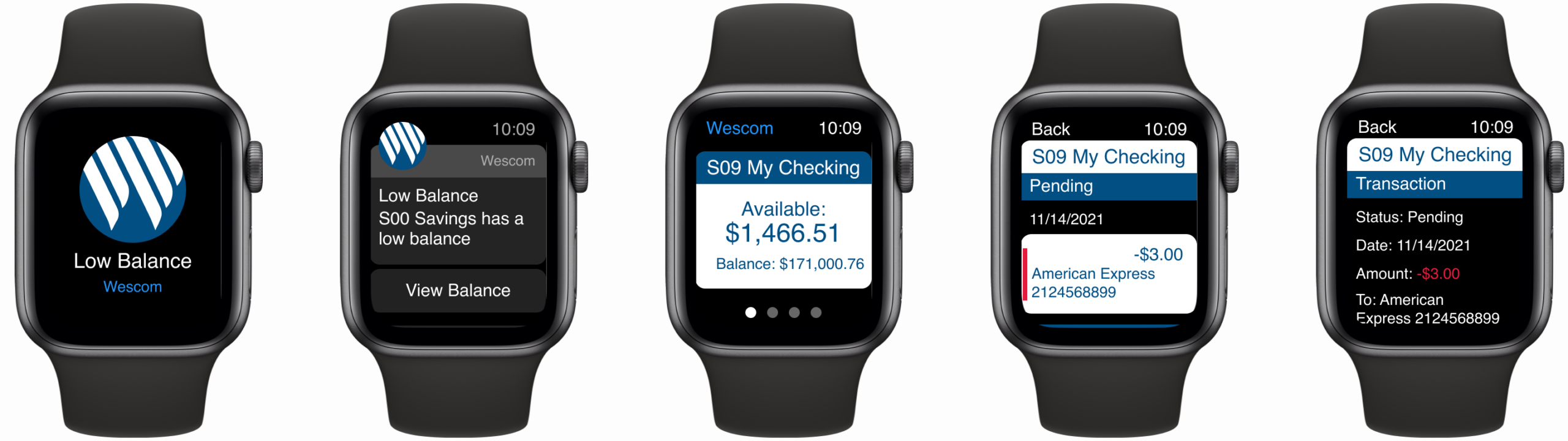
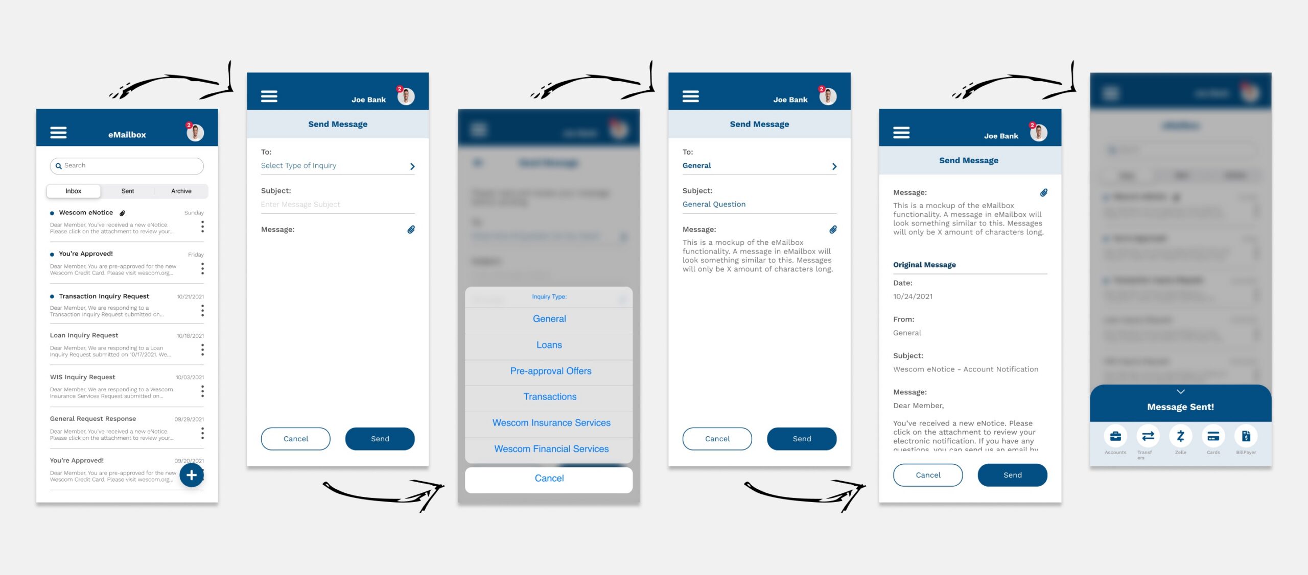
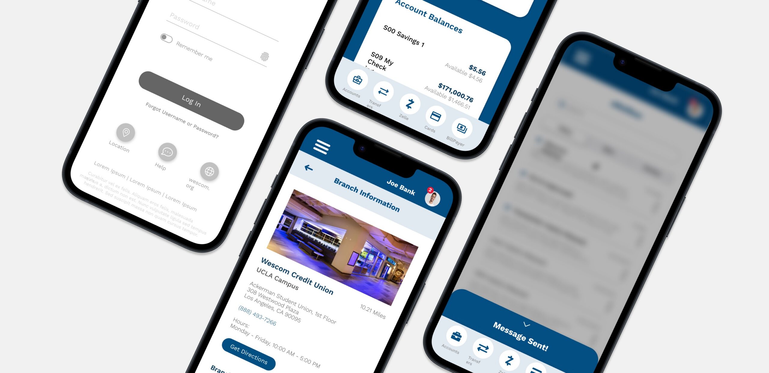
Wescom Credit Union Mobile Banking App
Redesigning a modern mobile banking experience for 200,000+ members.
OVERVIEW
Project context
Wescom Credit Union, headquartered in Southern California, had recently completed a full website redesign. The next step was modernizing their integrated mobile banking app — a product used daily by a diverse and growing membership base that values personalization and long-term relationship banking. I was the lead designer across the full project lifecycle — from initial discovery through asset handoff. I also served as the client-facing discussion lead during weekly collaboration meetings with the Wescom team, fielding questions and explaining design decisions.
PROBLEM STATEMENT
The challenge
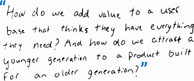
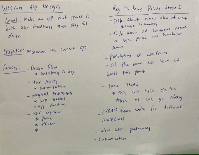
Redesign and optimize Wescom's mobile banking app to integrate with the online banking ecosystem, reduce friction, and scale for a planned Phase 2 expansion. The core tension: members were broadly satisfied with the existing app — so how do you improve something people think doesn't need improving?

DESIGN PROCESS
How we worked

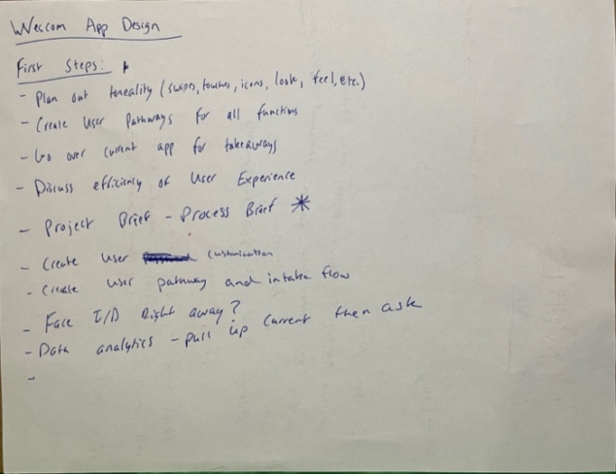
Discovery & stakeholder alignment
Workshops with IT, development, marketing, financial services, and digital teams

Internal audit & usage data analysis
Reviewed current app pain points from internal team survey and member interaction logs

Competitive analysis
Benchmarked 11 mobile banking apps via the 2020 Informa Financial Intelligence Report

Member survey (200+ responses)
Identified likes, dislikes, and feature requests from real app users

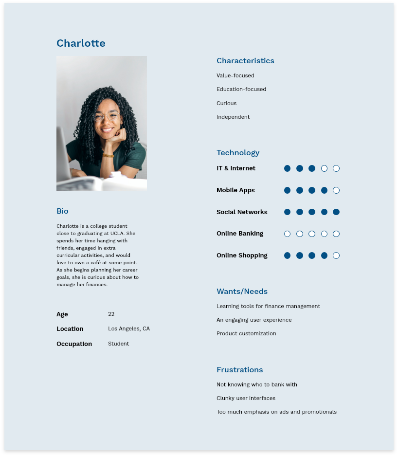
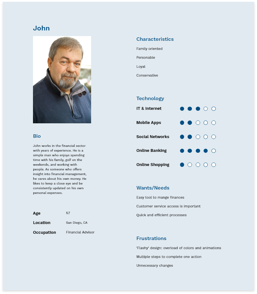
Persona development
Built two personas: current members and younger prospective members

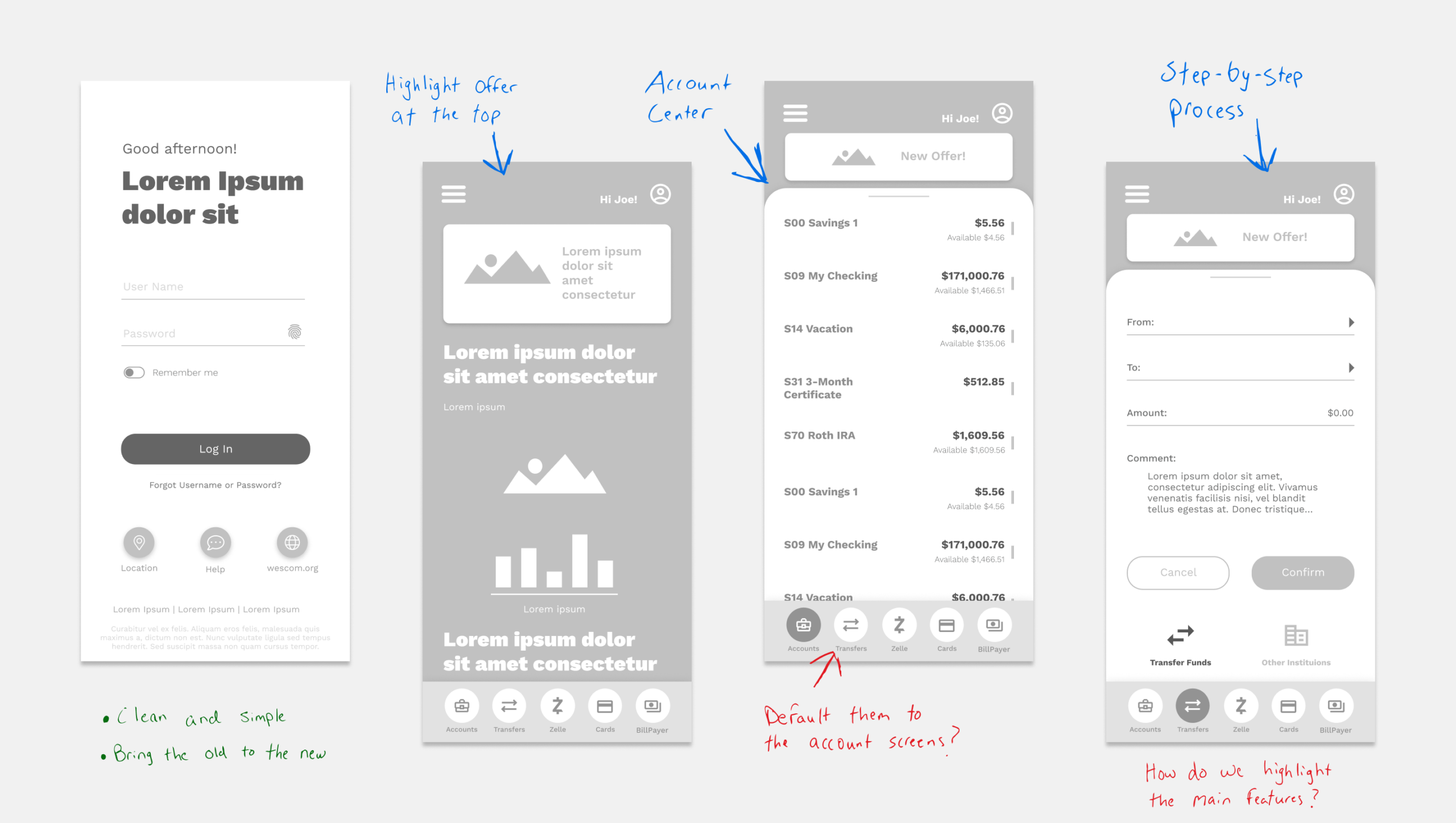
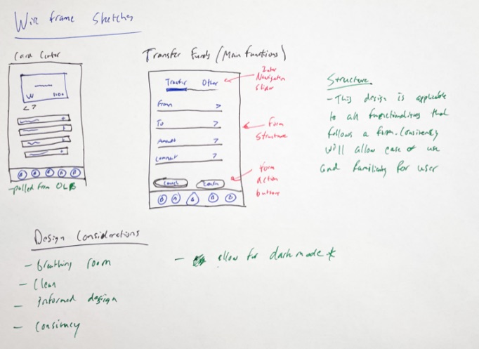
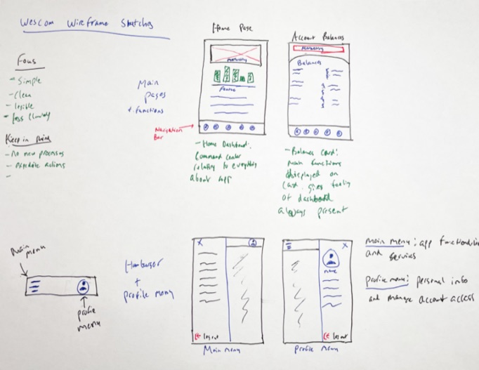
Design sprints, wireframes, visual design, prototype
Iterative weekly collaboration with Wescom stakeholders throughout

Stakeholder review & asset handoff
Final designs reviewed, refined, and passed to development
RESEARCH FINDINGS
What we learned
Top pain points (internal team survey)

Members couldn't see account balances immediately on login
Enlarged system fonts broke the navigation menu into multiple unlabeled pages
Pending items weren't surfaced from the balances screen
No quick access to loan applications or account opening on the login screen
Zelle integration was the most disliked feature among members
Competitive analysis takeaways
Citibank had high app store ratings despite fewer services; quality over quantity
Apps with the highest ratings tended to share more features in common
Opportunity to close service gaps and differentiate with uncommon features
OUTCOME
Results & reception
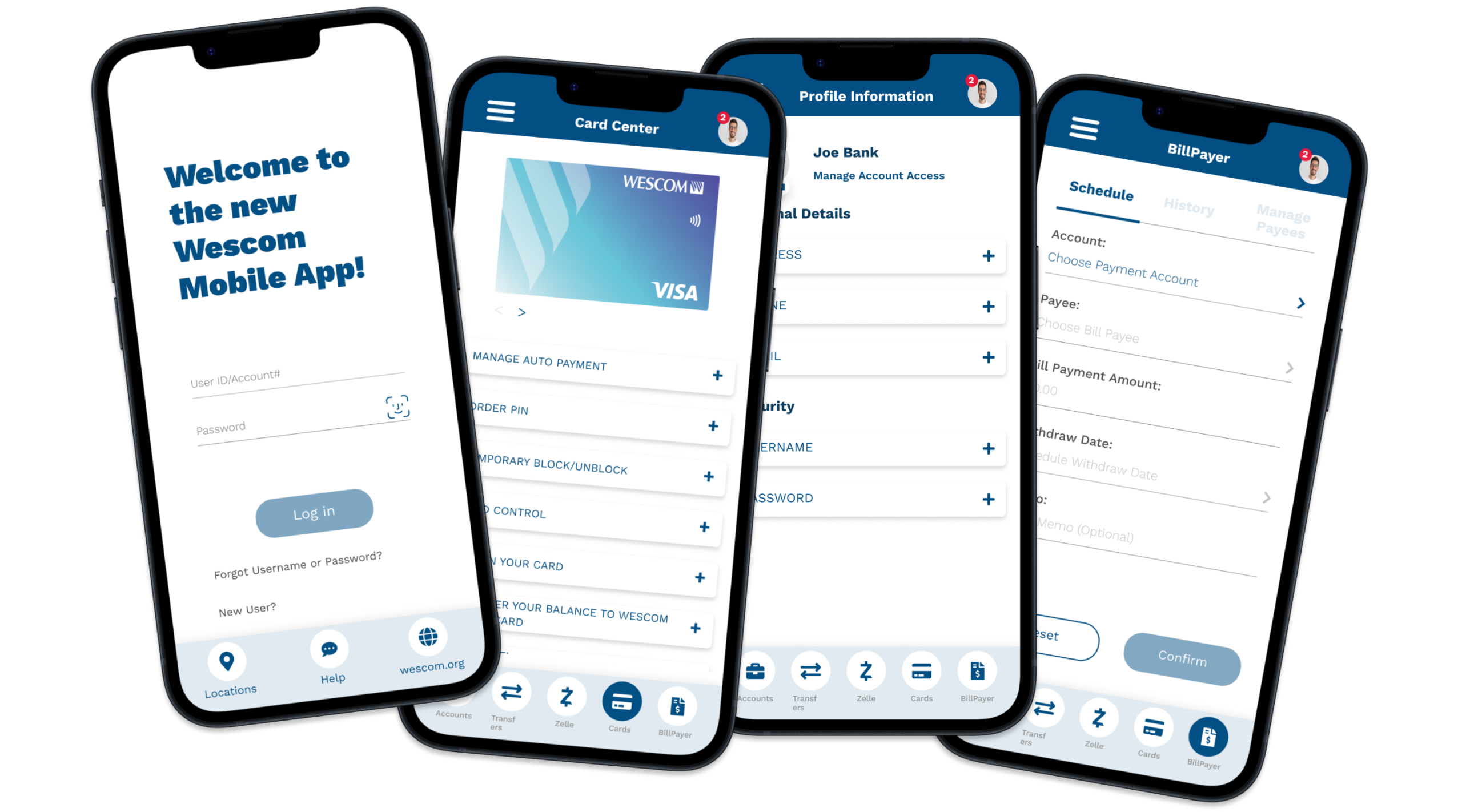
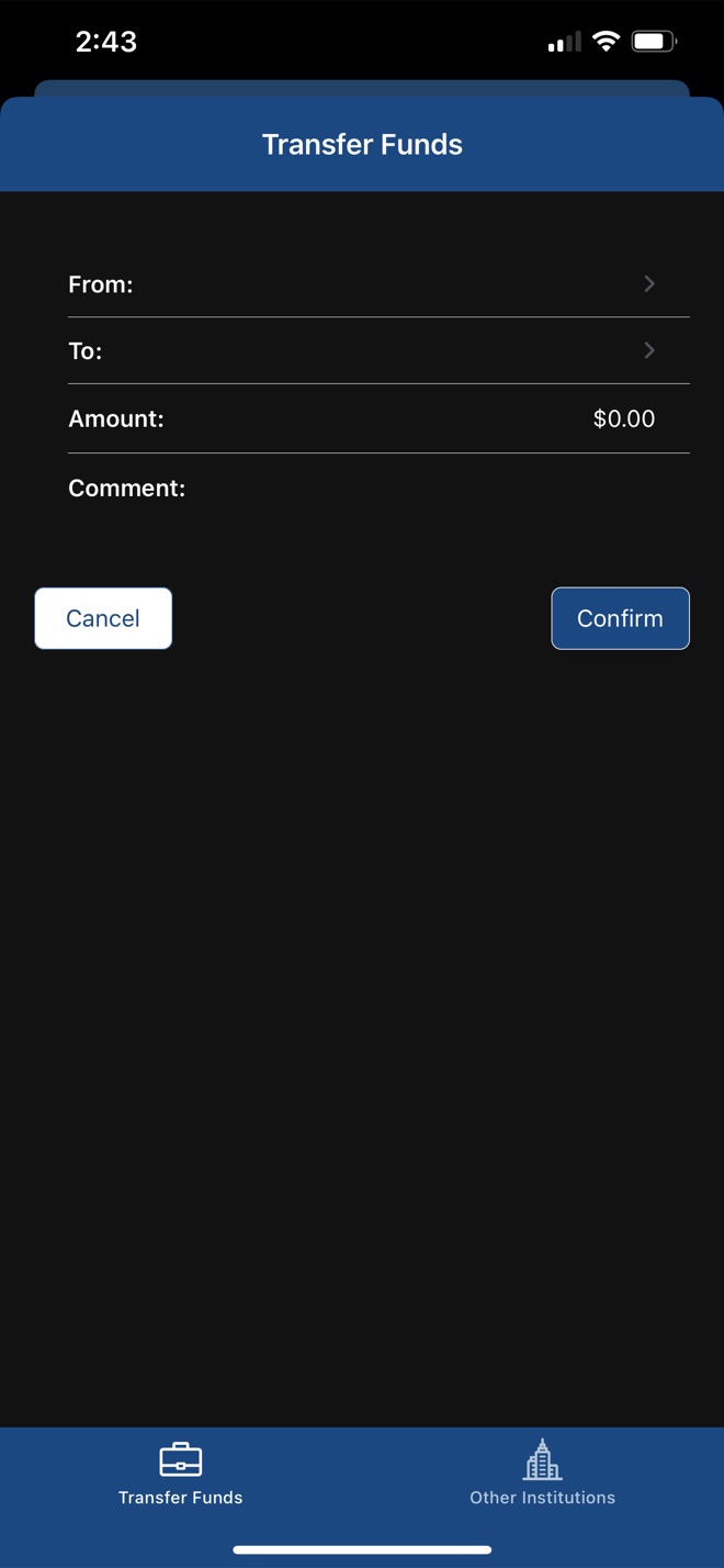
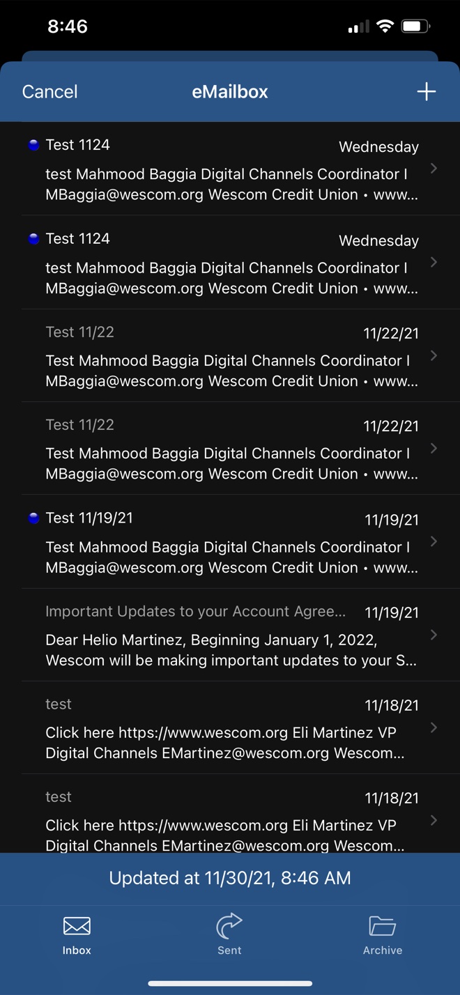
Designs were presented to internal stakeholders and received positively, with only minor revision requests. The final product captured the Wescom team's core objective: a modern, clean mobile banking experience that preserved the familiar structure members relied on.
 Clean, distinct visual design praised by stakeholders
Clear, frictionless user flows across key banking actions
Updated hamburger and profile menu received positive reception
Designs handed off to development, with Phase 2 scalability built in
Note: The Wescom team ultimately chose a different direction in production, but the designs satisfied all stated goals and the process was well received.
WORK
Project assets
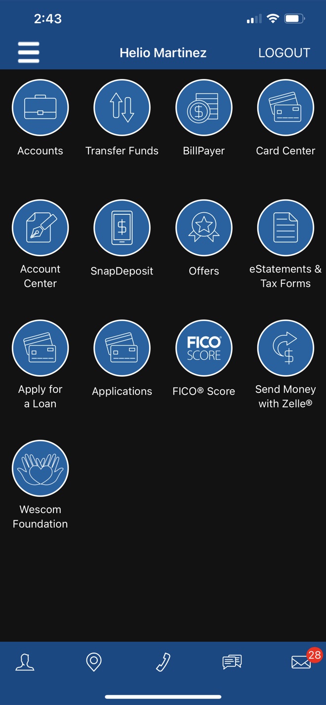
Original application
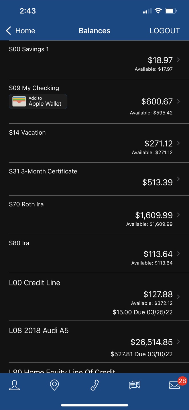
Final project