The Mather Group Family Office Launch
Brand identity and marketing collateral for the launch of a high-end estate planning division targeting ultra-high-net-worth clients.
OVERVIEW
Project context
The Mather Group is an independent wealth management firm headquartered in Chicago, IL. Their sub-brand, The Family Office, is a specialized arm dedicated to comprehensive estate planning for high-net-worth families. As The Family Office prepared to launch, I was brought in as a freelance designer to develop the branding and marketing materials that would introduce this new practice to prospective clients — a discerning audience where first impressions carry enormous weight.

PROBLEM STATEMENT
Designing for an ultra-premium audience
Wealth management at the family office level is a relationship business built entirely on trust, discretion, and perceived expertise. Every piece of collateral functions as a proxy for the quality of the firm itself. The design challenge was to create materials that communicate sophistication and authority without being cold, and that clearly differentiate The Family Office as a distinct, elevated offering within The Mather Group's broader practice.



TARGET AUDIENCE
Who these materials speak to
Ultra-high-net-worth individuals & families
Evaluating advisors for complex, multi-generational estate planning — expect materials that reflect the same precision applied to their finances
Prospective referral partners
Attorneys, CPAs, and other advisors who may refer clients — assess professionalism and credibility at a glance
Existing Mather Group clients
Being introduced to a new, specialized service — materials need to feel like a natural extension of a firm they already trust


DESIGN APPROACH
Brand and collateral strategy
A launch of this nature required a cohesive visual language that could span multiple collateral types — from a detailed pitchbook to the simplicity of a business card — while maintaining a consistent tone of quiet confidence throughout. Every design decision was filtered through the question of how it would land with a client accustomed to the highest standard of service.

Restrained elegance
Visual identity built on sophisticated typography, a refined color palette, and generous white space — premium without being ostentatious
Brand differentiation
The Family Office needed its own identity — distinct enough to stand alone, coherent enough to connect back to The Mather Group
Narrative structure
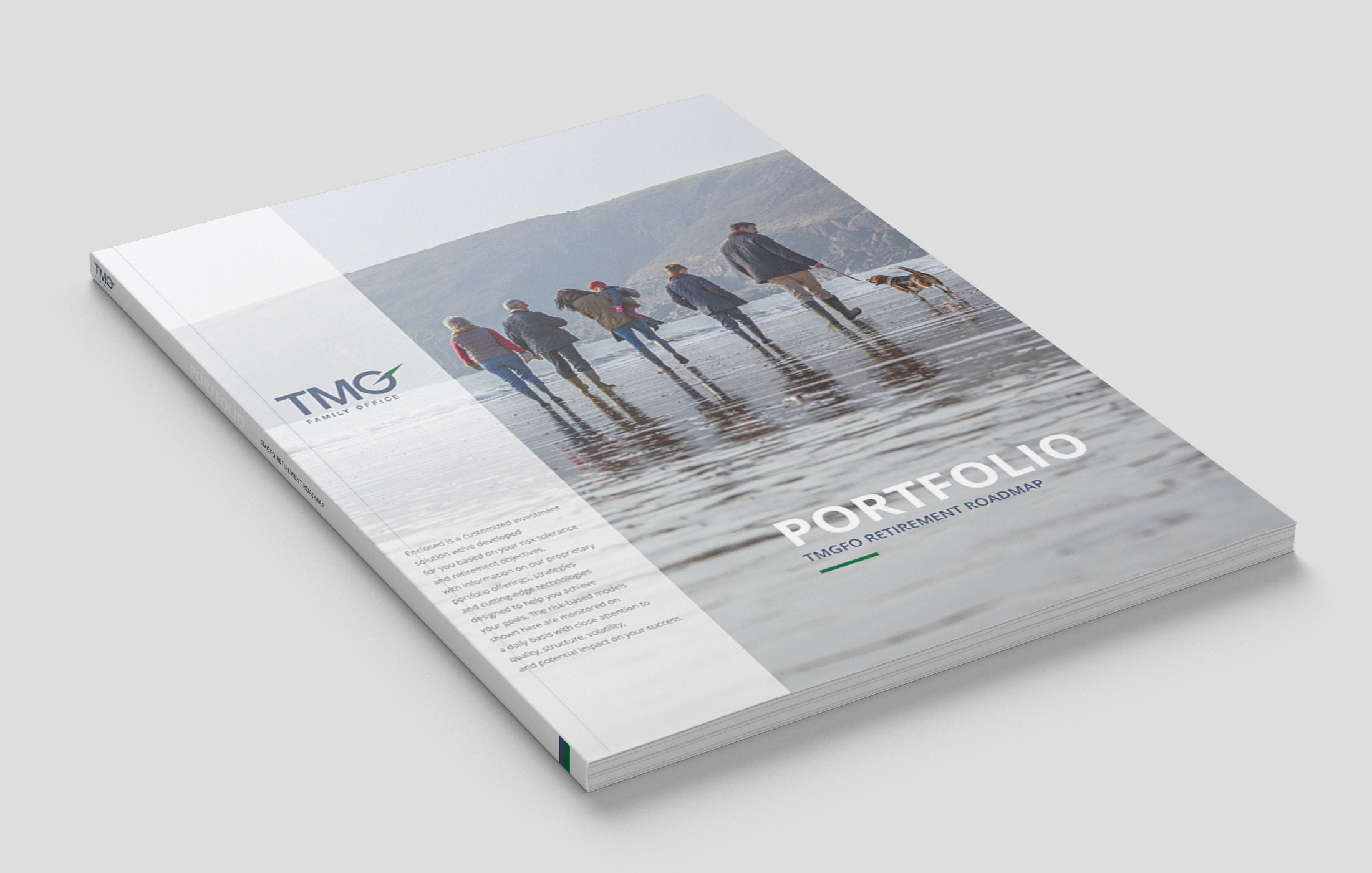
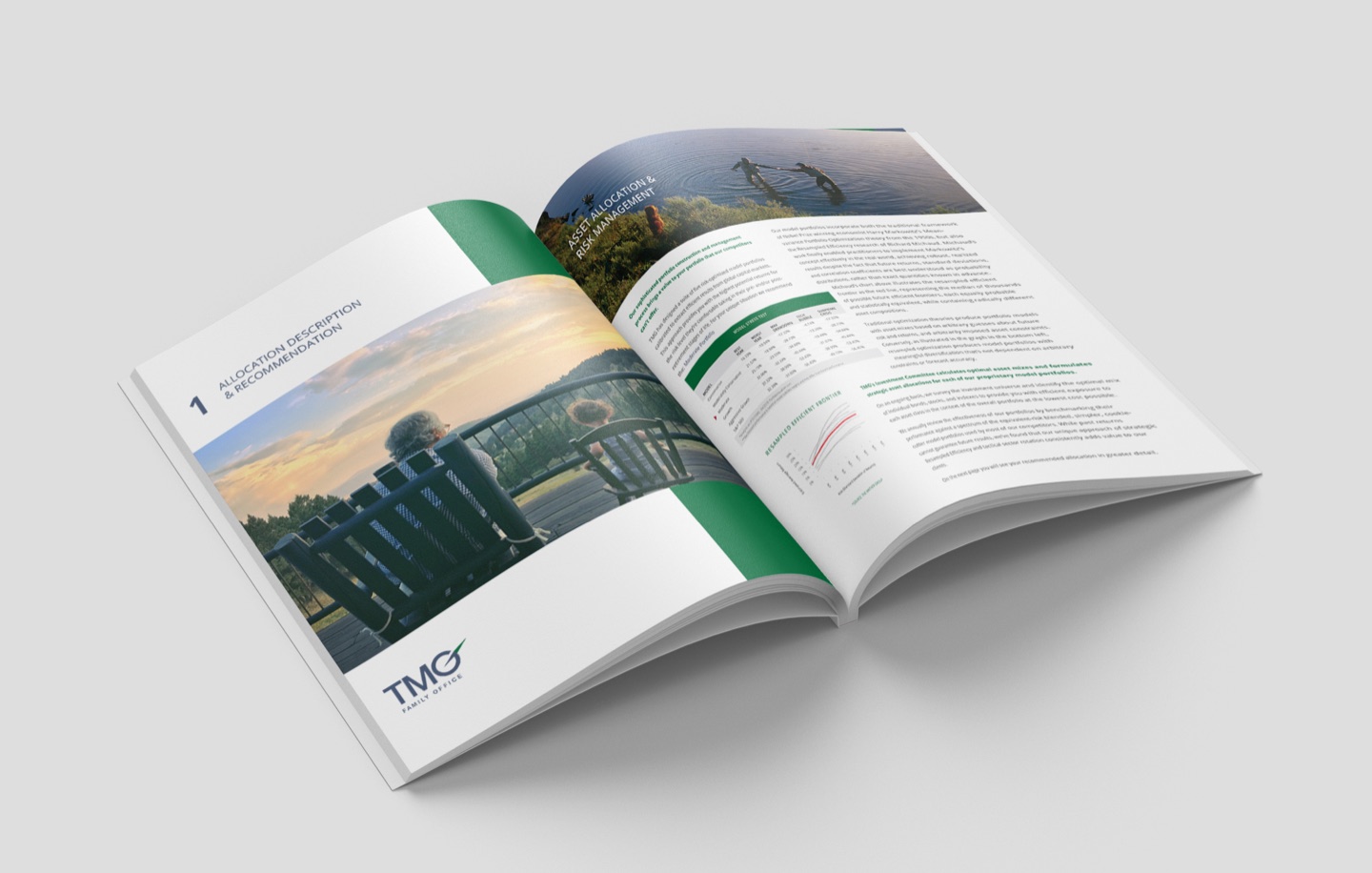
The pitchbook organized content to guide a prospective client through the firm's expertise, approach, and value proposition in a natural, persuasive flow
System consistency
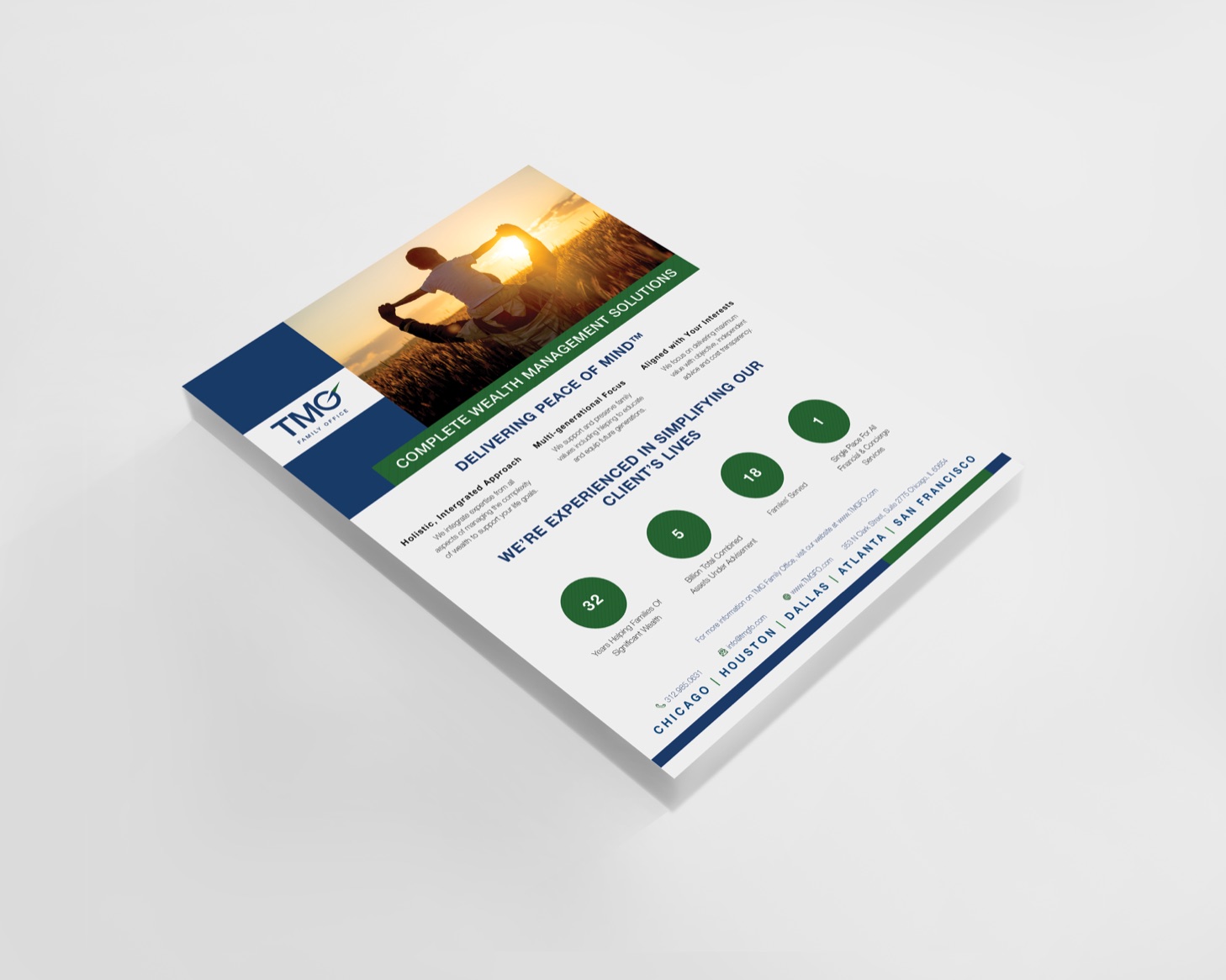
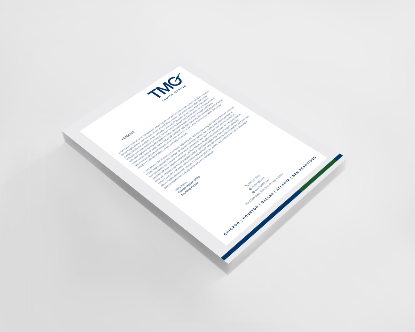
One-pagers and business cards extended the visual system across touchpoints, ensuring every interaction with the brand felt intentional and unified
DELIVERABLES
What was produced

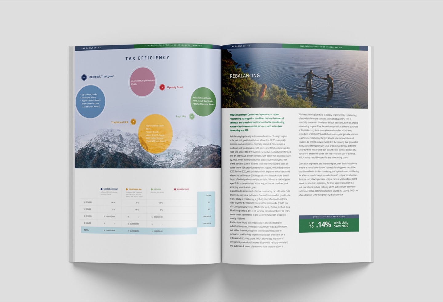
Client portfolio pitchbook
The flagship launch document — a comprehensive, designed presentation introducing The Family Office's services, philosophy, team, and differentiators to prospective clients

One-pagers
Concise, leave-behind documents distilling key service offerings and value propositions for use in meetings and introductory conversations

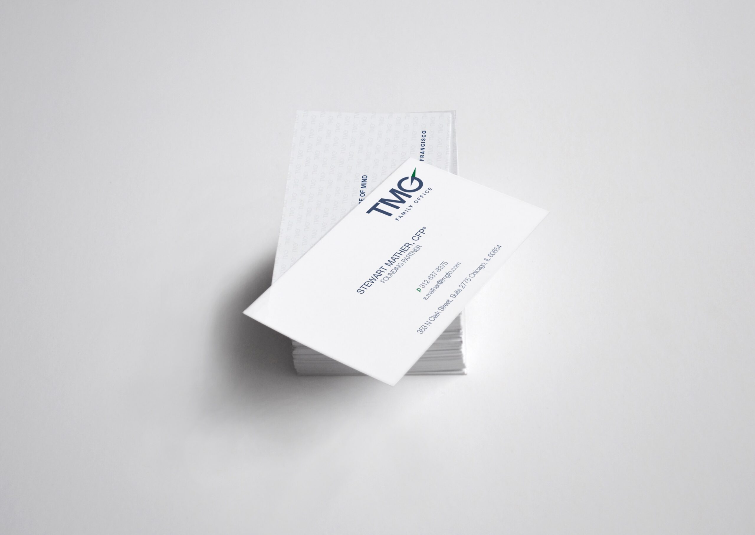
Business cards
Physical identity touchpoint designed to match the premium positioning of the broader collateral suite — a first impression that carries the brand's tone into every in-person interaction


OUTCOME
Results
I delivered a complete launch collateral suite that gave The Family Office a polished, credible market entry — arming the team with materials equal to the caliber of the clients they were pursuing.
 Cohesive brand identity established for The Family Office as a distinct sub-brand within The Mather Group
Pitchbook structured to guide high-net-worth prospects through the firm's value proposition with clarity and confidence
Visual system extended consistently across print touchpoints — pitchbook, one-pagers, and business cards — functioning as a unified suite
Launch materials positioned The Family Office to compete credibly at the highest tier of private wealth management